Oil pastel technique and Expression
The tricky thing about learning to communicate, or express, ideas or feelings in art is that it is much more than getting better at drawing a subject that 'looks' like something. For instance, if I wanted to make a drawing about a scared cat, a first thought might be to draw the cat scared with a scared expression and with it's fur on end . . . perhaps I might include another character in the drawing that is scaring the cat. However, another way to approach expression in art is to use the media, tools and techniques to help tell the story.
To show you what I mean, in the works below I examine the way students have applied oil pastel to their choice of black or purple construction paper and how their application of the pastel changes the expression of the drawing.
Examples # 1 & # 2
The two works of art below are an example of drawings by the same student where her application of the oil pastel changes the expression of the composition. In the first drawing, #1, she applied the oil pastel using a light touch and the side of the pastel. In #2, I asked her to draw the same picture but to use the tip of the oil pastel and press hard to create a thick application of oil pastel.
# 1: using a light touch and the side of the oil pastel.
# 2: Similar composition but this time the student pressed down hard with the tip of the oil pastel for a thick application.
Examples # 3 & # 4
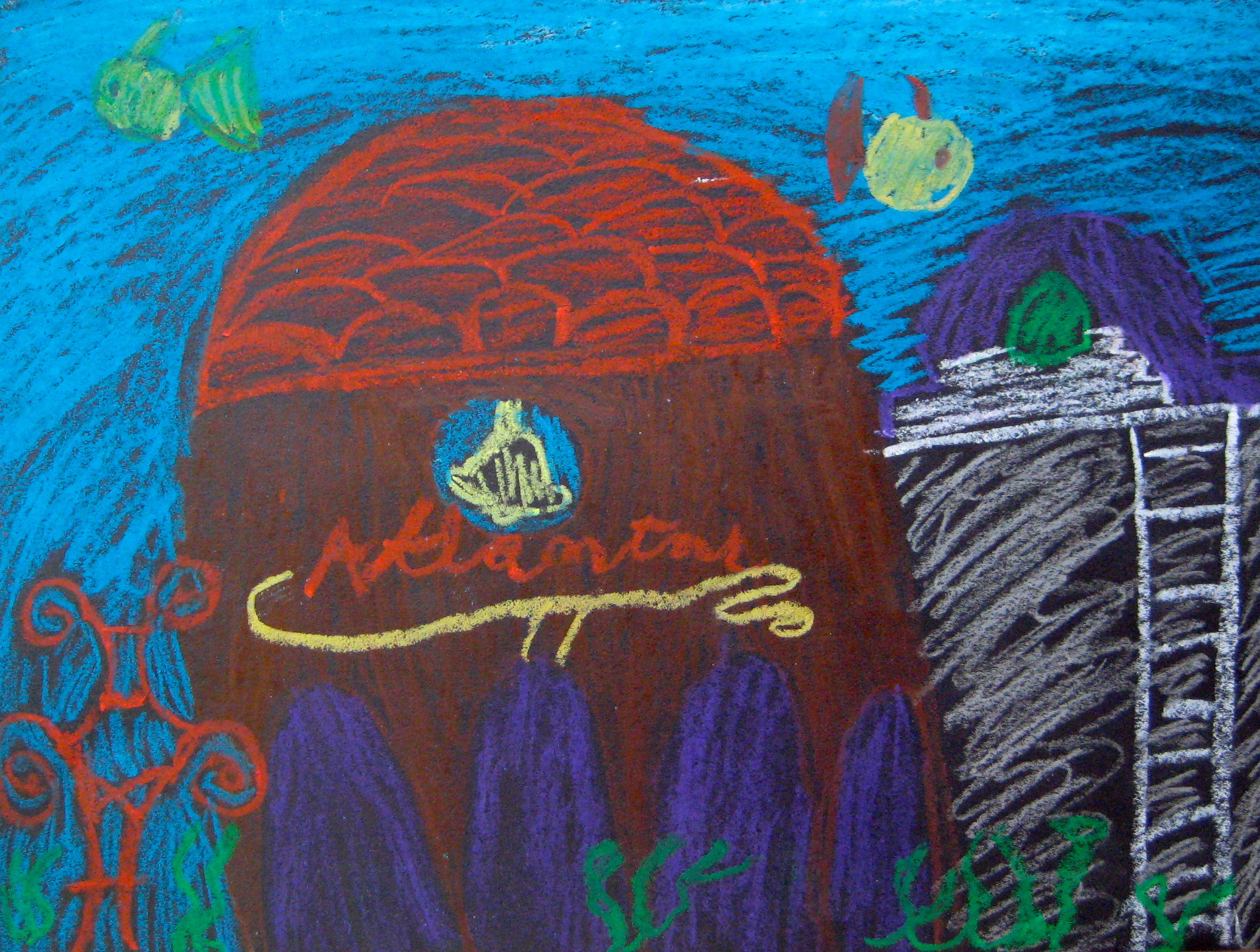
The next two examples demonstrate how application of the pastel and color scheme can change the feeling of a drawing.
In #3, the student used the side of the pastel and layered blue over her house to create the effect of seeing the house through a layer of water.
In the second underwater building, #4, the student used a warm orange that makes the building 'pop' forward. In addition, the thickly applied oil pastel contributes to a more solid, bright effect.
Also notice how color influences the feeling of depth in these scenes. Cool colors appear to go back in space (#3) and warm colors appear to move forward (#4).
For me, #3 feels dreamy and mysterious; #4 feels bright and festive. Similar scene, similar content but different application of the pastel & color scheme and the result is a very different expression in the two works of art.
# 3
# 4
Example # 5
Example # 5 is by a student who used the oil pastel technique and color scheme to great dramatic effect. The main part of the composition is monochromatic with thick white outlines and side of the oil pastel technique. He then contrasts this with the thickly applied orange, red and yellow surrounding the person at the top. Contrasting the technique and color scheme in this way in the same composition creates drama and intensifies the effect of the plummeting person.
# 5
Examples # 6 & # 7
Numbers 6 and 7 are two more examples of how color scheme completely changes a picture. They were done by two students at the same table who were happy to share the idea of the tree house. Same idea, very similar trees but again, the results are so different!
# 6
# 7
As beginners, how students choose to use the materials and colors is often unconscious or a matter of chance or preference. But as they grow in experience, these choices can become much more conscious and part of the complex thinking process that goes into creating expressive works of art.
Two more thoughts about the student works of art on this page:
Sharing ideas:
Examples 6 & 7 are great examples of why I create a classroom environment where students are encouraged to share ideas.
First of all, students always come up with a greater variety of creative ideas for imagery & techniques for using materials than I could ever come up with myself.
Secondly, as can be seen in numbers 6 & 7, students have very personal ways of using & applying the materials and tools (techniques) and in an environment where they feel safe to explore, students generally end up with very different looking, and feeling, works of art.
Pop culture imagery in student art:
In my art classroom, students practice using imagery that comes from their own observations, memories and imaginations. Sometimes, what students are interested in and what they remember is imagery from pop culture, video games, books and comics.
An example: the underwater houses in numbers 3 & 4. These students were sitting across the room and were asked to stay in their seats that day so, weren't able to share their idea while working like student examples 6 & 7. I think they were drawing from a similar source of imagery--SpongeBob Squarepant's pineapple house.
I hear teachers say that they don't like students to use popular imagery--issues like cliche or inappropriateness come up and yes, that can be something to question . . . but by and large, I welcome those images and ask students to work on them by changing, combining, adding to the imagery. My experience is that it is important in art to draw on what you know and what interests you--that is how you make the art your own. Consequently, the more students work on the imagery that interests them, the more that imagery has an opportunity to transform into something more personal and begin to be mixed up with other influences and things students have worked on in art class or morphed by the application of the tools and materials as shown above.


